
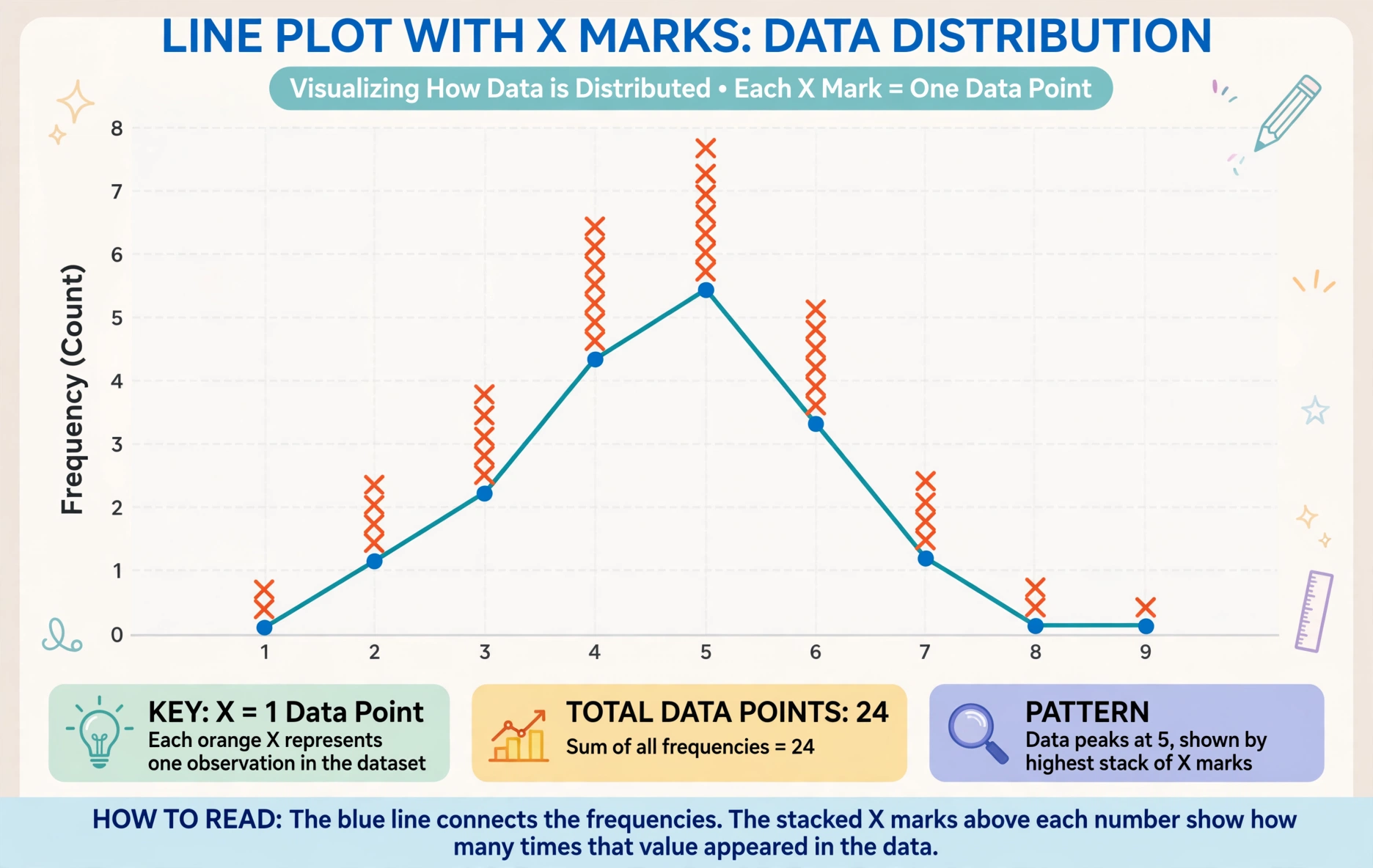
Measure everyone’s pencil. Mark each length with an X above a number line. Step back. You see piles where many pencils share a length, gaps where none do. That picture is a line plot, and it turns a list of numbers into a story.
What Is a Line Plot?
A line plot is a graph that displays data using X marks (or dots) above a number line. Each X represents one data point. If three students have 5-inch pencils, there are three Xs above the 5 on the number line.
Line plots are simple but powerful. They show distribution: where data clusters, where it spreads, what is typical, what is unusual. All from Xs on a line.
How Do You Read a Line Plot?
Look for clusters (piles of Xs), gaps (empty spaces), and outliers (lone Xs far from the rest). A cluster shows the common values. A gap shows missing values. An outlier might be a measurement error or something interesting.
Count the Xs to find totals. “How many pencils were measured?” Count all Xs. “How many were 6 inches?” Count Xs above 6. The plot answers questions that a list makes tedious.
Why Use Line Plots?
They are the first step into data analysis. Before bar graphs and histograms, line plots teach students to see patterns in numbers. The number line foundation connects to measurement and fractions.
Line plots also handle fractional data beautifully. Measure to the nearest half-inch and plot on a line with halves marked. Students see fractions in real data, which is more meaningful than abstract exercises.
Try It: Make Line Plot
Step 1: Measure something: pencil lengths, hand spans, book widths.
Step 2: Draw a number line covering the range.
Step 3: Each student marks an X above their measurement.
Step 4: Discuss: Where is the cluster? Any gaps? What is the most common?
Quick Practice
Question: A line plot shows 5 Xs above 4, 3 Xs above 5, 1 X above 6. How many data points? What is the mode?
Answer: 9 data points (5+3+1). Mode is 4 (most Xs).
Frequently Asked Questions
What is the difference between a line plot and a line graph?
Line plots show data distribution with Xs. Line graphs show change over time with connected points. Different tools for different purposes.
When are line plots taught?
Typically 2nd-3rd grade for whole numbers, 4th-5th for fractions. They are foundational for data literacy.
Can line plots show fractions?
Yes, and they should. Plot measurements to nearest 1/2 or 1/4. The fractional number line reinforces fraction concepts in a real context.